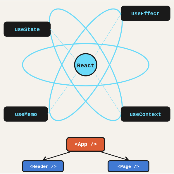
React is a component model, not a full framework. Understanding hooks, context, the reconciliation algorithm, and state management patterns determines whether you build maintainable apps or component soup. This post is a practical reference you can come back to whenever you are starting a new project or need a quick refresher.
TL;DR: A React reference covering hooks, component patterns, context, performance, routing, and state management.
Stack: React, JavaScript/TypeScript
Level: Intermediate
Reading time: ~25 min
Creating a project with Vite
Forget Create React App. Vite is faster, leaner, and the modern standard for starting React projects. These three commands get you running in under a minute.
npm create vite@latest . --template react-ts
npm install
npm run dev
Adding Tailwind
Tailwind is a utility-first CSS framework. Instead of writing .card { padding: 16px; }, you write p-4 directly on the element. It sounds unusual until you try it, and then you can’t go back.
npm install -D tailwindcss postcss autoprefixer
npx tailwindcss init -p
Open tailwind.config.js and configure the content paths:
/** @type {import('tailwindcss').Config} */
export default {
  content: [
    "./index.html",
    "./src/**/*.{js,ts,jsx,tsx}",
  ],
  theme: { extend: {} },
  plugins: [],
}
Open src/index.css and replace everything with these three lines:
@tailwind base;
@tailwind components;
@tailwind utilities;
Design system with CSS variables
Before going full Tailwind on everything, it helps to define base design tokens: colors, fonts, spacing. Think of it as a contract between you and the UI. Every button and heading uses the same values, so changing a brand color means editing one line, not fifty.
:root {
  --primary-color: #007bff;
  --secondary-color: #25292d;
  --success-color: #28a745;
  --error-color: #dc3545;
  --background-color: #f8f9fa;
  --text-color: #343a40;
  --primary-font: 'Roboto', sans-serif;
  --spacing-small: 8px;
  --spacing-medium: 16px;
  --spacing-large: 32px;
}

.primary-button {
  background-color: var(--primary-color);
  color: white;
  padding: var(--spacing-small) var(--spacing-medium);
  border: none;
  border-radius: 4px;
  font-family: var(--primary-font);
}

.heading {
  font-family: var(--primary-font);
  font-size: 24px;
  font-weight: bold;
  color: var(--text-color);
  margin-bottom: var(--spacing-medium);
}
Tailwind essential classes
Tailwind has hundreds of utilities, but most real projects rely on maybe 30 of them. Here is a quick reference for the ones you will use constantly.
Layout
flex,inline-flex: enable flexboxgrid: enable CSS Gridgrid-cols-{n}: define column countgap-{n}: spacing between itemsjustify-*: align on main axisitems-*: align on cross axis
Sizing and spacing
w-{n},h-{n}: width and heightp-{n},m-{n}: padding and marginmax-w-{n}: max widthmin-h-{n}: min height
Typography
text-{size}: font sizefont-{weight}: font weighttext-{color}: text colorleading-{n}: line height
State variants and effects
hover:{class}: apply on hoverfocus:{class}: apply on focusactive:{class}: apply when activetransition: smooth transitionsshadow,shadow-lg: drop shadowscursor-pointer: pointer cursor
Styled Components
If Tailwind is not your style (no pun intended), Styled Components lets you write actual CSS inside your component file. Full CSS power with component scoping. The tradeoff is styles live in JavaScript, which some people love and others find deeply unsettling.
npm install styled-componentsimport styled from 'styled-components';
export const Button = styled.button`
background-color: ${(props) => (props.primary ? 'blue' : 'gray')};
color: white;
font-size: 16px;
padding: 10px 20px;
border: none;
border-radius: 5px;
cursor: pointer;
&:hover {
background-color: ${(props) => (props.primary ? 'darkblue' : 'darkgray')};
}`;Component that consumes an API
Real apps fetch data. Here is the full pattern: install axios, define a TypeScript interface for the response shape, fetch on mount inside a useEffect, and render. The interface might look like a lot of typing, but it saves you from runtime surprises when the API changes its shape.
npm i -D axios dotenv @types/nodeDefine the interface for the API response and fetch inside a useEffect:
// CountriesList.tsx
import React, { useState, useEffect } from 'react';
import axios from 'axios';
interface Country {
name: { common: string; };
capital: string[];
region: string;
population: number;
flags: { png: string; };
cca2: string;
}
const CountriesList: React.FC = () => {
const [countries, setCountries] = useState([]);
useEffect(() => {
const fetchData = async () => {
try {
const response = await axios.get(`${import.meta.env.VITE_BASE_URL}`);
setCountries(response.data);
} catch (error) {
console.error('Error fetching countries:', error);
}
};
fetchData();
}, []);
return (
Countries
{countries.map((country) => (
-

{country.name.common}
Capital: {country.capital[0]}
Region: {country.region}
Population: {country.population}
))}
);
};
export default CountriesList; State management with Redux Toolkit
Redux used to be painful. Redux Toolkit eliminated most of the boilerplate. The pattern is: create a slice (state and reducers in one file), configure the store, wrap the app in a Provider, then read with useSelector and write with useDispatch. Think of it as a shared whiteboard where any component can read or write, without having to pass props all the way down.
npm install @reduxjs/toolkit react-reduxCreate the slice at src/store/cartSlice.ts:
import { createSlice, PayloadAction } from '@reduxjs/toolkit';

interface CartItem { id: number; name: string; price: number; quantity: number; }
interface CartState { items: CartItem[]; }

const cartSlice = createSlice({
  name: 'cart',
  initialState: { items: [] } as CartState,
  reducers: {
    addItem: (state, action: PayloadAction) => {
      const existing = state.items.find(i => i.id === action.payload.id);
      if (existing) { existing.quantity += action.payload.quantity; }
      else { state.items.push(action.payload); }
    },
    removeItem: (state, action: PayloadAction) => {
      state.items = state.items.filter(i => i.id !== action.payload);
    },
  },
});

export const { addItem, removeItem } = cartSlice.actions;
export default cartSlice.reducer;
Configure the store and wrap the app:
// src/store/index.ts
import { configureStore } from '@reduxjs/toolkit';
import cartReducer from './cartSlice';

export const store = configureStore({ reducer: { cart: cartReducer } });
export type RootState = ReturnType;
export type AppDispatch = typeof store.dispatch;
// main.tsx
import { Provider } from 'react-redux';
import { store } from './store';
createRoot(document.getElementById('root')!).render(
);Testing with TDD and Testing Library
TDD in React means: write the test first, watch it fail, then write the minimal component to make it pass. It feels backwards at first, but it forces you to think about the interface before the implementation. Testing Library’s philosophy is to test behavior, not internals: if a user can see it or click it, that’s what you test.
npm install jest @testing-library/react @testing-library/jest-dom @testing-library/user-event @types/jest ts-jest ts-node jest-environment-jsdomAdd jest.config.ts and update tsconfig.json:
// jest.config.ts
export default {
  preset: 'ts-jest',
  testEnvironment: 'jsdom',
  testMatch: ['**/**/*.test.tsx']
};
// tsconfig.json (add to compilerOptions)
"types": ["node", "jest", "@testing-library/jest-dom"],
"jsx": "react-jsx"Write the test first, then the component:
import { render, screen } from '@testing-library/react';
import { CountryList } from './CountryList';
import '@testing-library/jest-dom';
test('CountryList renders countries', async () => {
render(Common queries and matchers
findAllByRole: find by semantic role (async, waits for element)getByRole: find by semantic role (sync, throws if not found)getByTestId: find by data-testid attributequeryByText: returns null if not found (useful for negative assertions)toHaveLength(n): check array lengthtoBeInTheDocument(): element exists in DOMtoHaveTextContent('text'): element contains texttoHaveAttribute('href', '/home'): element has attribute value
Always import @testing-library/jest-dom in your test files. Without it, the custom matchers like toBeInTheDocument will throw confusing errors.
What you’ve built
A complete React setup: Vite with TypeScript, Tailwind, a design system with CSS variables, API consumption with proper typing, Redux Toolkit for global state, and a TDD workflow with Testing Library. These are the building blocks of real production apps.
Next steps
- Learn the React reconciliation algorithm: it explains why key props matter, when to split components, and why unnecessary re-renders happen.
- Use the React DevTools profiler to find actual performance bottlenecks before adding useMemo and useCallback everywhere.
- Separate server state from client state. React Query handles API data cleanly, leaving useState and useReducer focused on UI-only state, which is much cleaner than dumping everything in Redux.